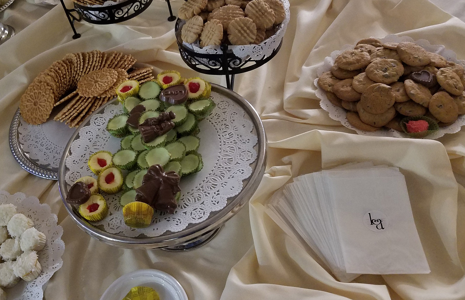
A logo for Kristen & Andy
These two gave me free rein when exploring designs for them, but when I suggested integrating a shared hobby or interest, their mutual love of music bubbled to the top, and ultimately guided my design.
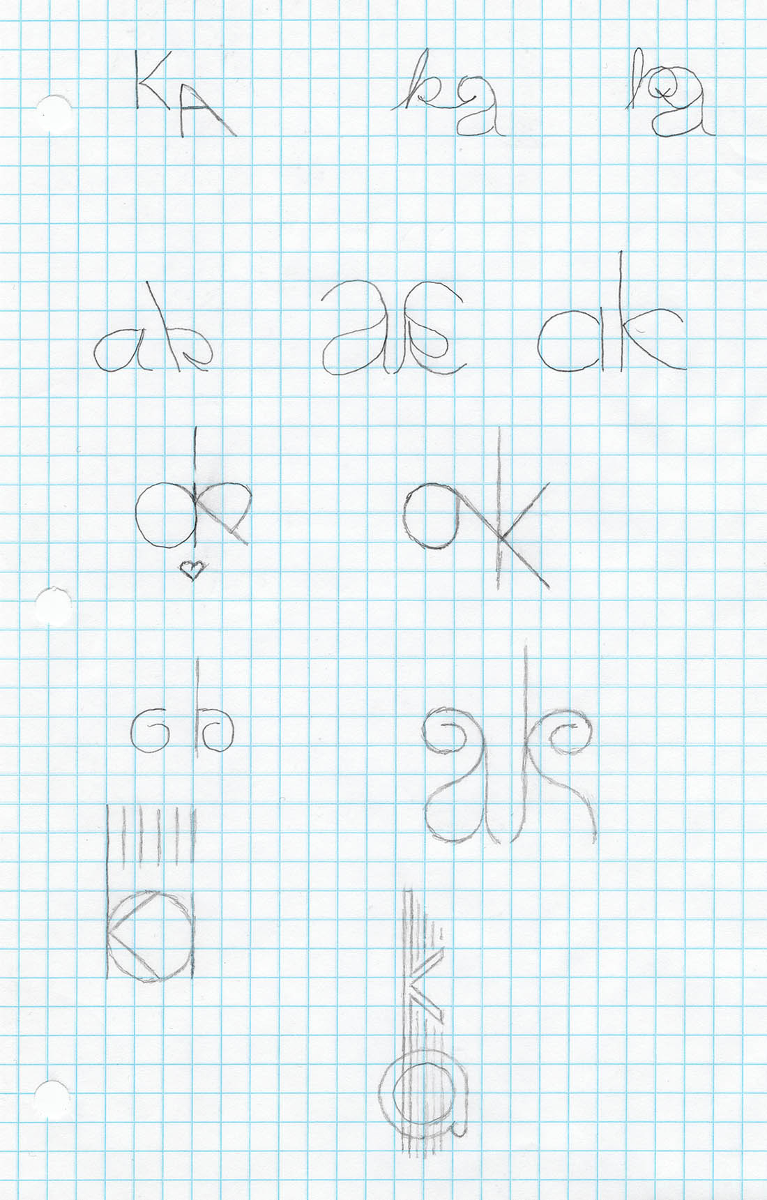
As is often the case with when I’m working with two names or two words, early sketches explored how the initials might interplay, searching for symmetry or a graceful blending of the two. I also played with blending the letters into linework evocative of a guitar or symbols from a musical score.
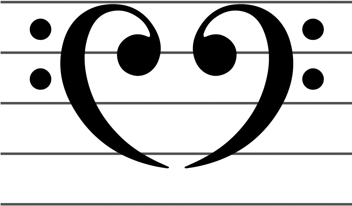
Having worked a heart into the letters of my own wedding logo, I thought that could be a fun addition here as well. Realizing that written sheet music's bass clef resembles half of a heart, a quick mockup mirroring it confirmed that this idea could work.
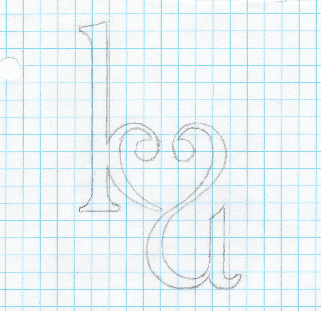
Then the question became, could these two clefs facing opposite directions be worked into the letters K and A? If I made the letters lowercase, the answer was yes.
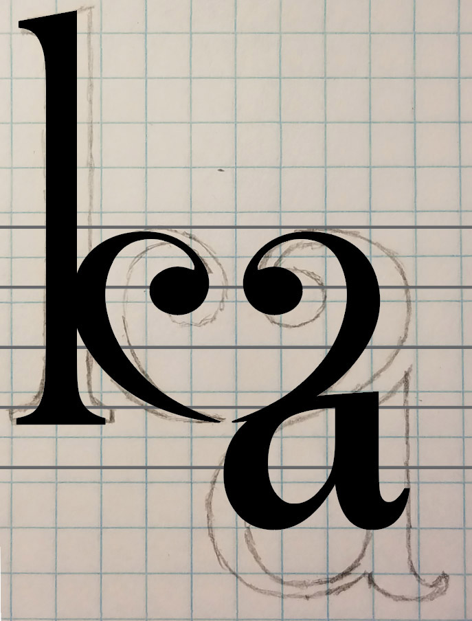
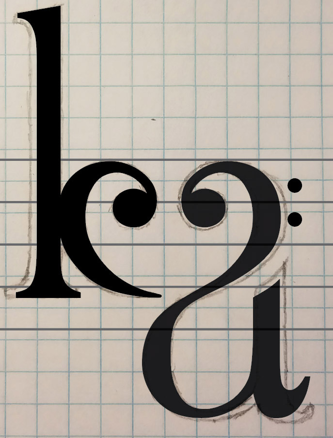
From there I scanned the sketch and jumped into Illustrator, where I could start pushing and pulling to create the line art. I added the lines of a music staff, as well as the two dots that would make the clef immediately recognizable.
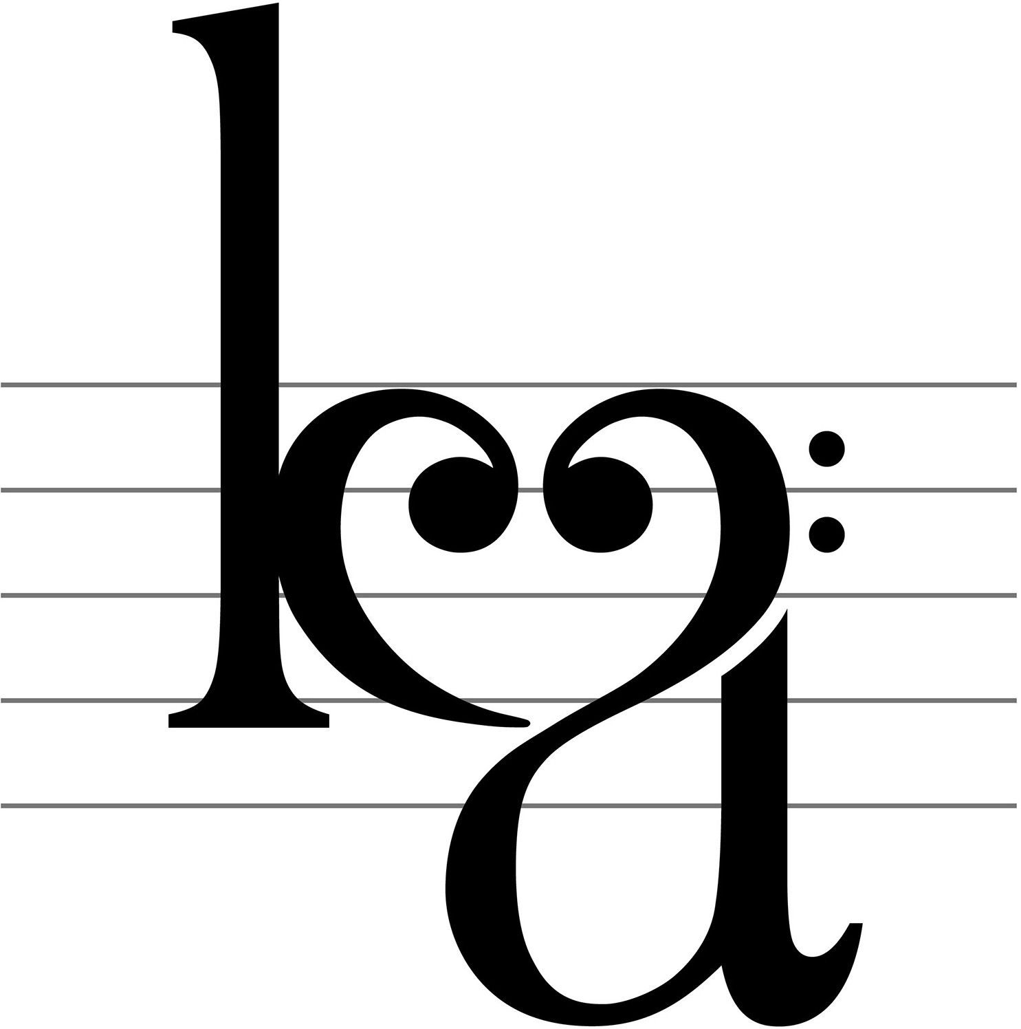
After pushing the clefs closer together (to make the heart as recognizable as possible) and reducing the gap on the right side (to make the“a”as recognizable as possible), I had the final logo.
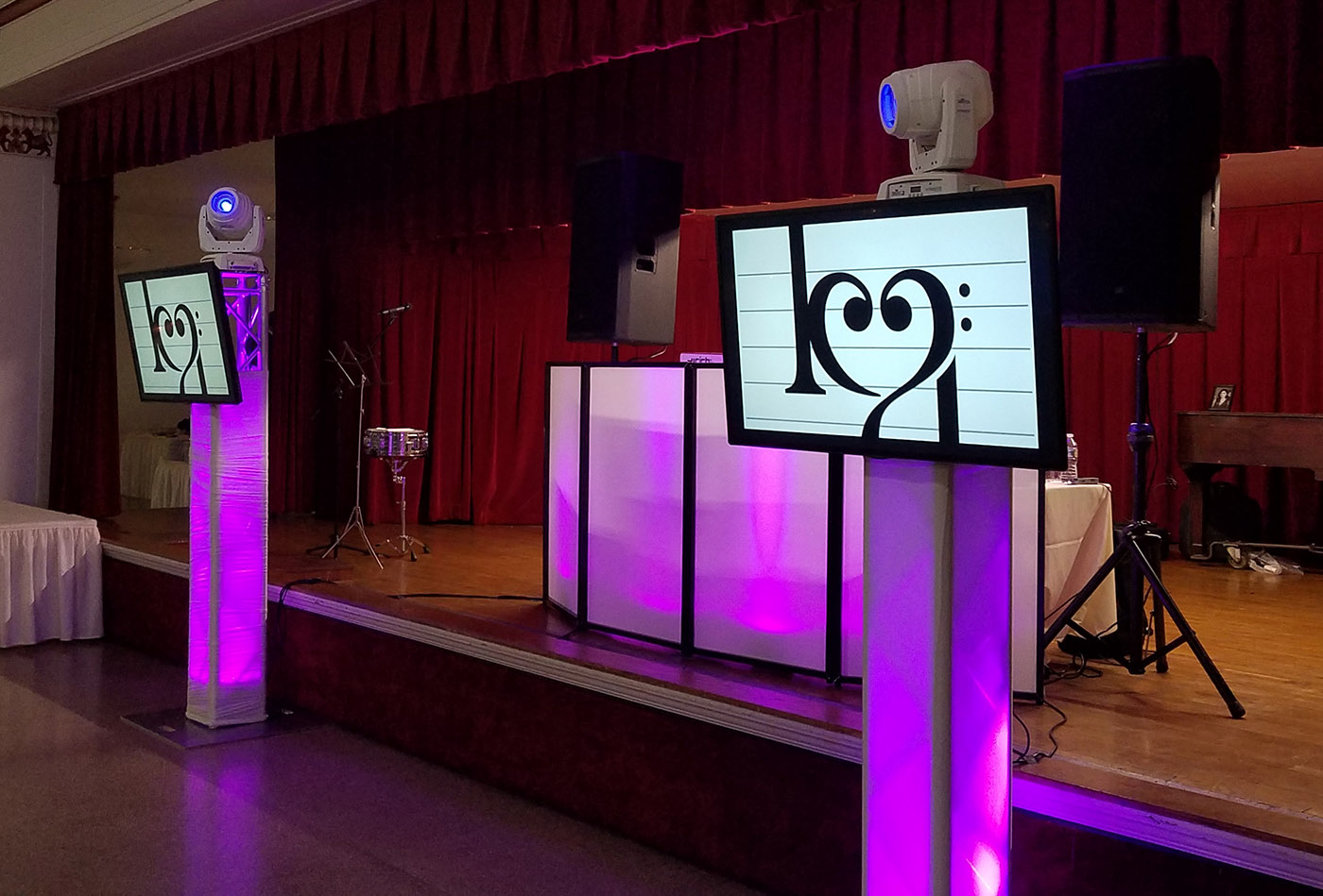
From there it was time to put this logo to use!
