A new identity for Arkapana Consulting
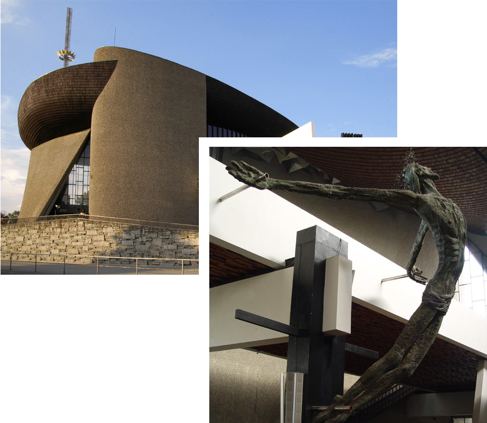
I took on this project for a startup focused on social media campaigns for nonprofits. Dedicated to the belief that "good people, organized around a shared belief, can change the world," the company's name was inspired by Arka Pana church (though the client decided to consolidate its name into one word). Erected as a symbol of hope in Krakow's Nowa Huta township, this church's bold architecture is meant to be evocative of the Biblical ark, and is built around an unconventional crucifix sculpture. With these designs as visual inspiration, I attempted to create a logo that would serve as a simple, elegant, and recognizable symbol of her company.

Looking at the Arka Pana church and sculpture, I began with a variety of sketches, attempting to integrate the sculpture, the nautical theme, or both.

Once the client and I settled on sketch G, I got to work in Illustrator...

I aimed to capture both the church's boat-like shape and the essence of the sculpture, while maintaining simplicity. Combining that final sketch with a bit of color, I arrived at Arkapana Consulting's new logo.

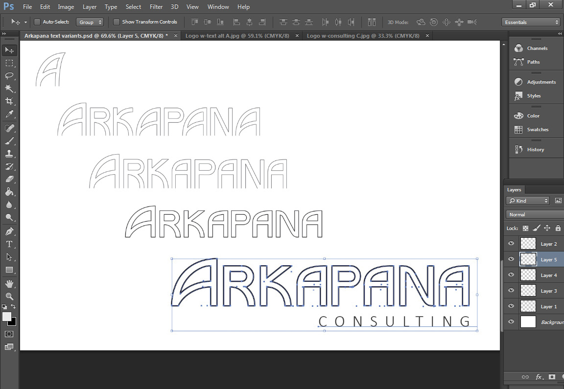
With the logo set, I got to work on the lettering. I decided to create a custom typeface for the word Arkapana, and presented some slight variations for review.

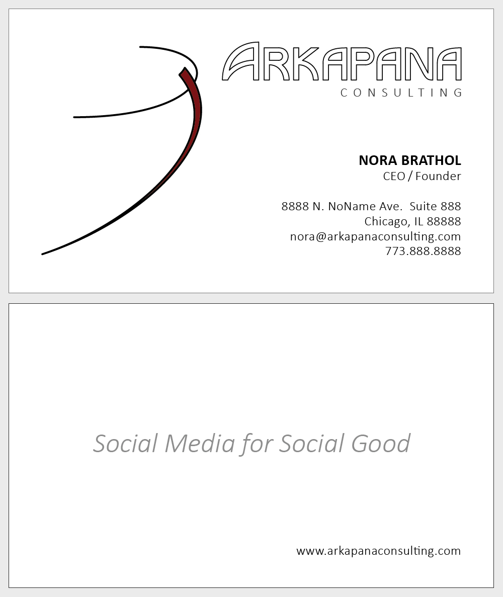
Once I had fine-tuned the lettering and other details, I put together a business card for printing.