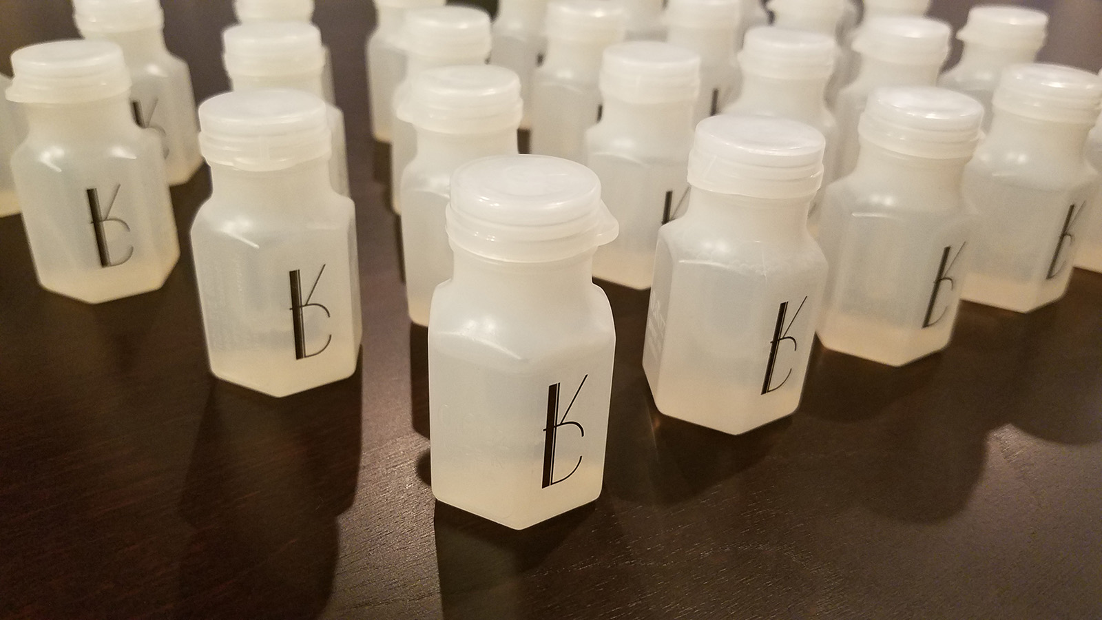
A logo for Katie & Dale
Katie and Dale were looking for a wedding logo to personalize everything from table cards to guest favors, while visually tying in with existing invitations that did not include the logo. I was able to dive into the details of typeface design, crafting each letter to achieve a certain overall look.
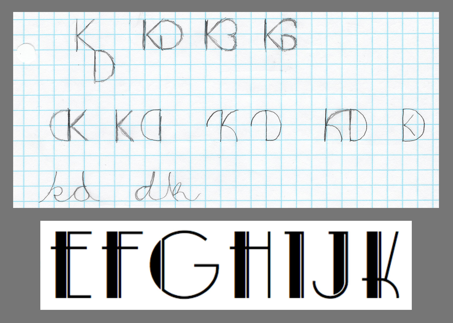
Early sketches and font searches explored a number of directions, but my big takeaways from our initial conversation were “Art Deco” and “simple”. With a basic Art deco typeface as inspiration, I started to narrow my focus.
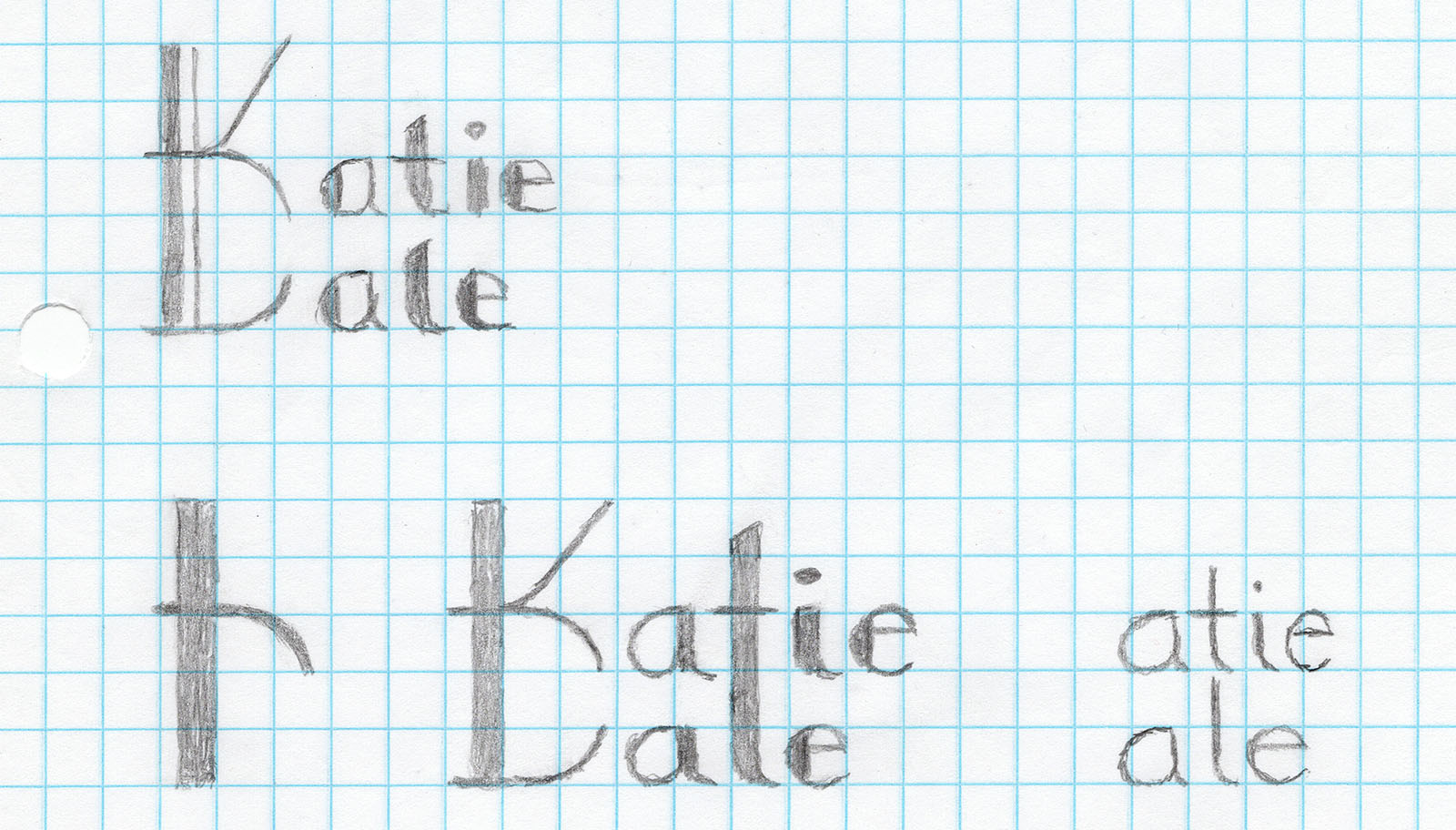
While sketching ways to integrate the K and D, I explored ways the logo could be adaptable to include names or only initials, which would later be ideal for items of various shapes.
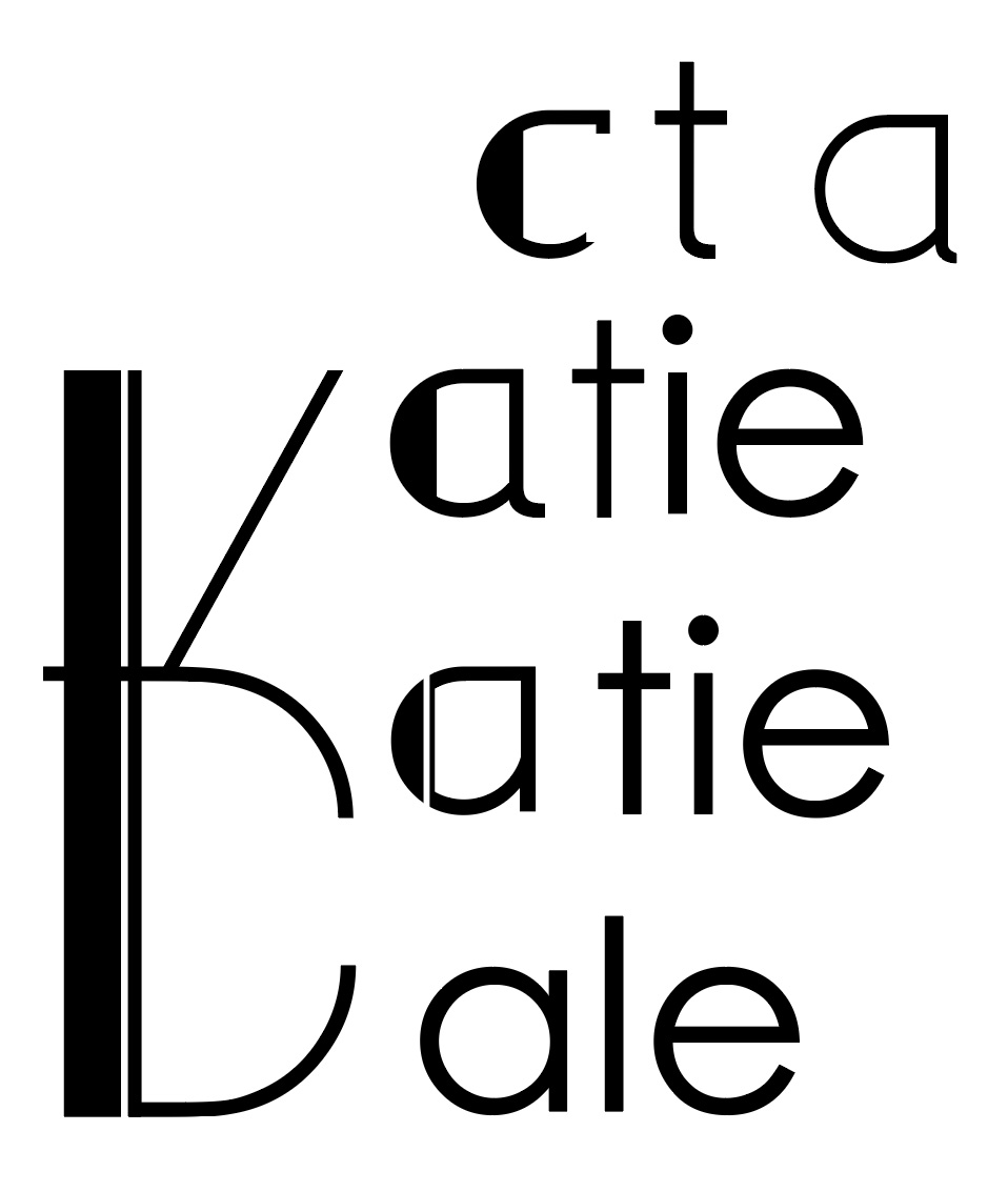
With a basic idea on paper, I moved into Illustrator, exploring details in higher fidelity. Here I’m playing with the basic styling of the lowercase letters.
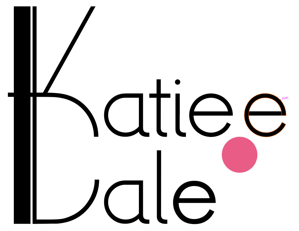
And here I’m really tweaking things like kearning and subtle shapes. Should the “t” and the “l” be vertically aligned, or does a slight offset ease visual tension? Should that “e” be truly round, or should it be slightly compressed?
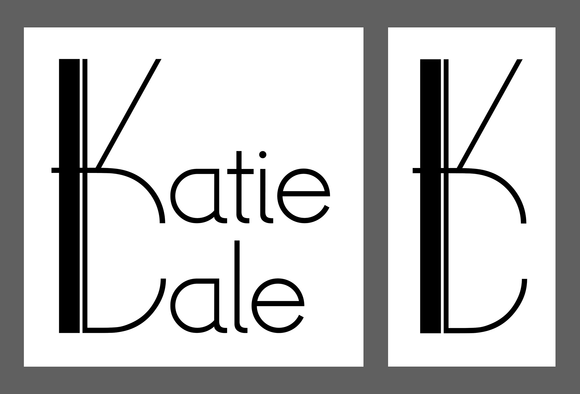
With all those questions answered, we had a final design...
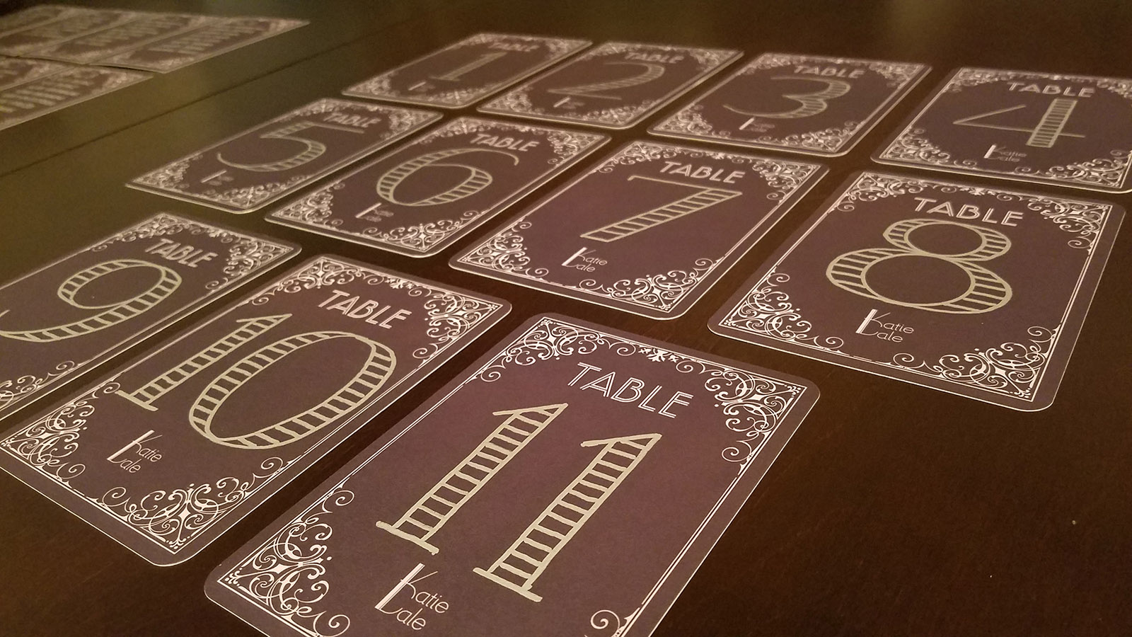
...but the work wasn’t finished. I next created blank guest-list and table-number cards that incorporated the new logo while matching the original invitations.
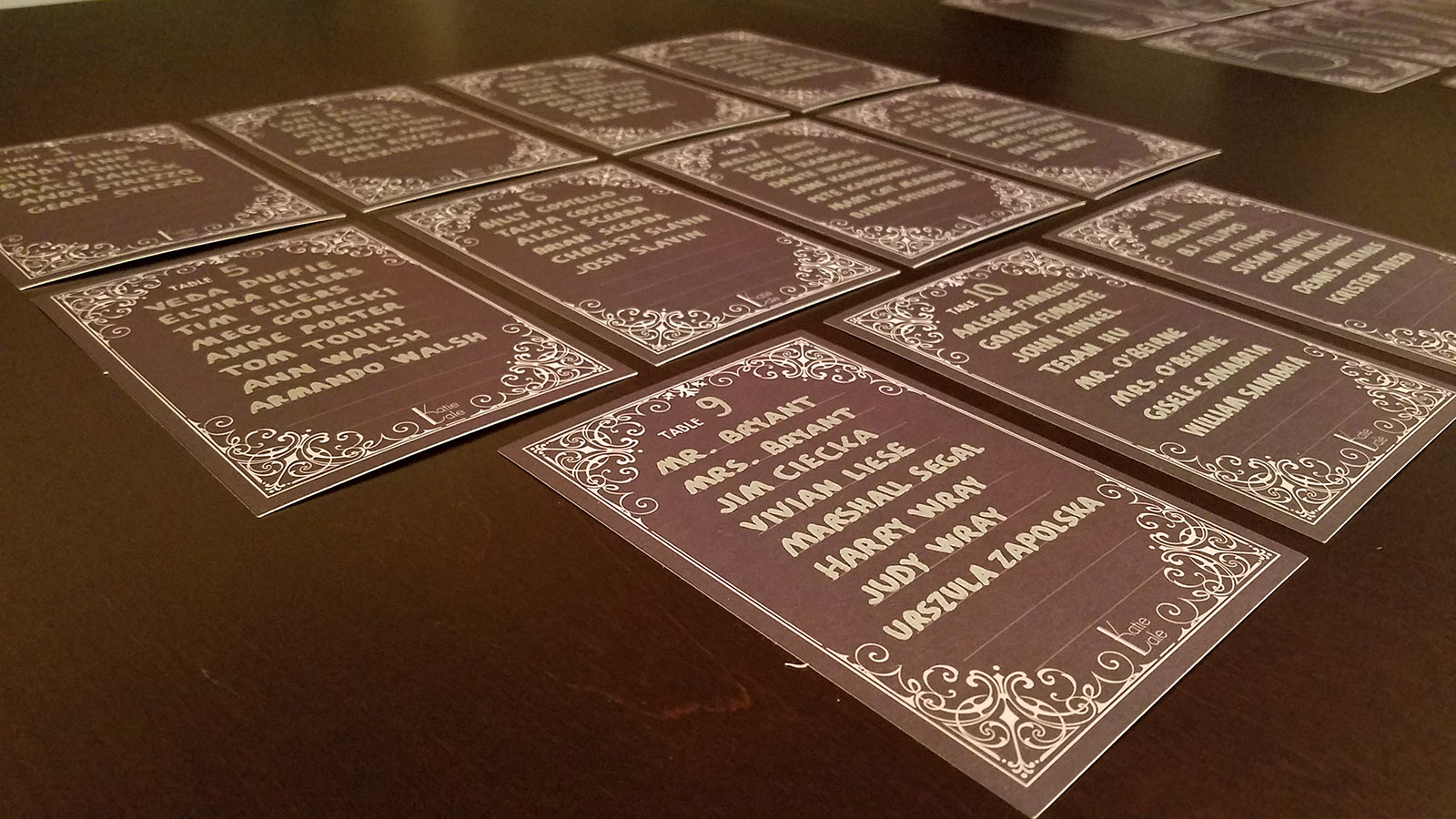
Careful hand-labeling with silver marker enabled me to combine handmade interest with professional appearance. It also facilitated last-minute guest-list additions.
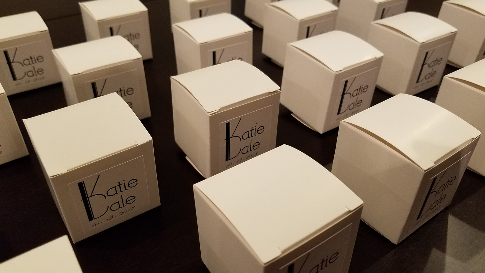
Finally, I created custom-sized labels and applied them to gift boxes and bubble bottles the bride had selected.
